First Home
-
Summary
-
NIMA MIRZAMOHAMADI
Farmanieh , Tehran – 2018
180 m2
Residential
Built
 Credit : finalist in MEMAR awards , 2019
 -
-
About
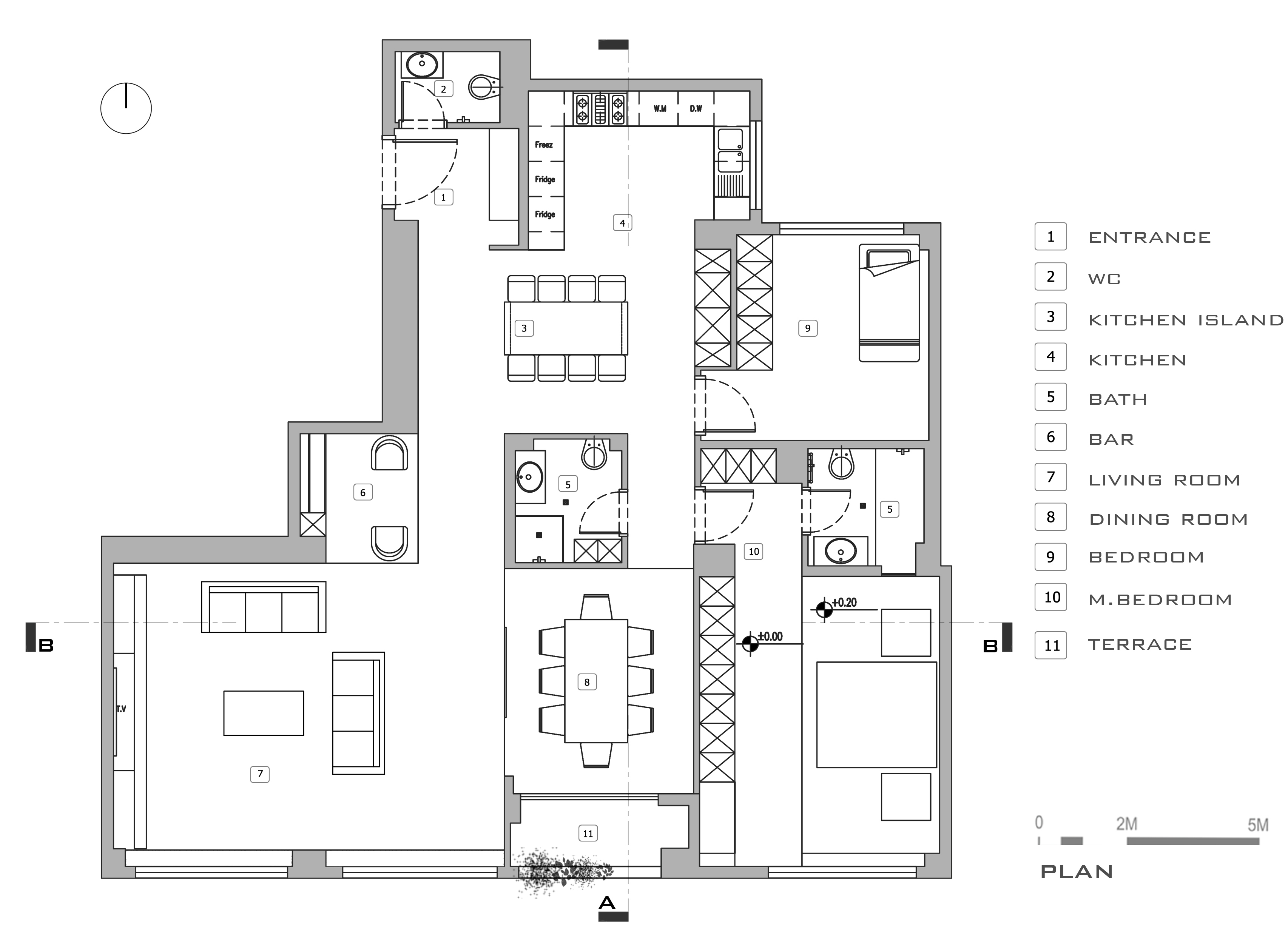
The first home is always important, especially when it is a couple's first home. The couple came to us when the house was bought, a sixth floor apartment with 3 bedrooms, 2 rooms and a part of the hall from the south, with light and views. It was straight, but the other parts of the photographer were receiving a grade 2 light.
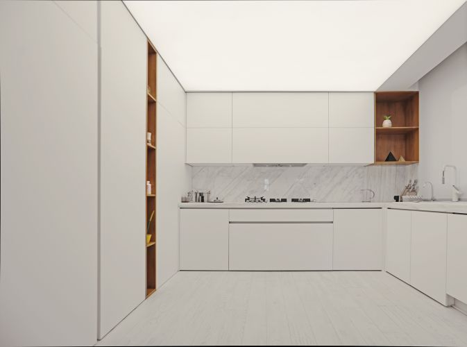
The first issue in our view was the relatively low space energy of this home, to begin the life of a young couple. The kitchen and the interpretive space at the center of the unit were lacking in light and lack of vision, and there was no space for the dining room that could play an important role in this home.
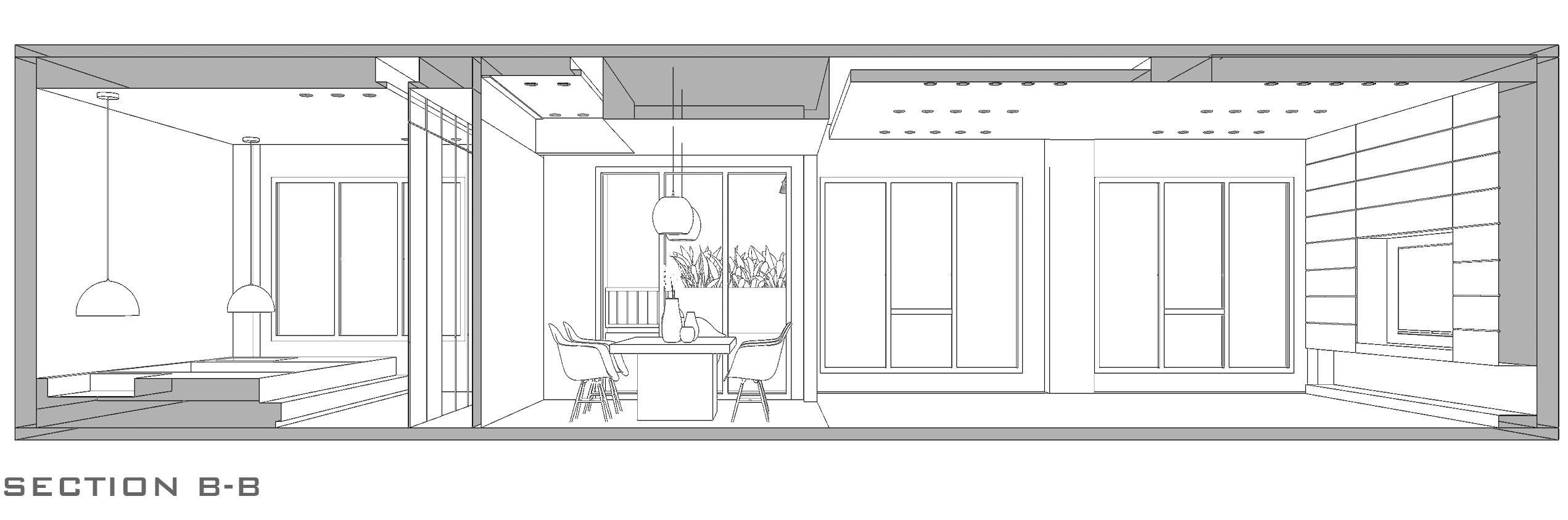
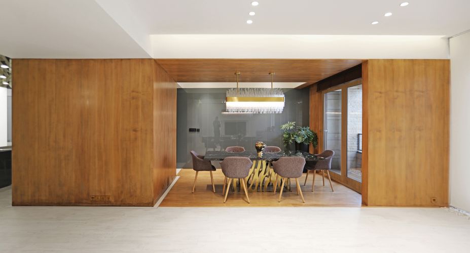
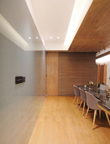
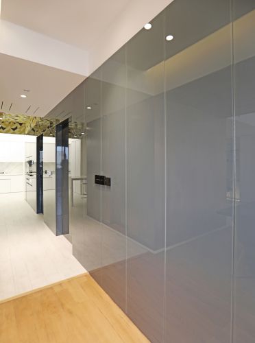
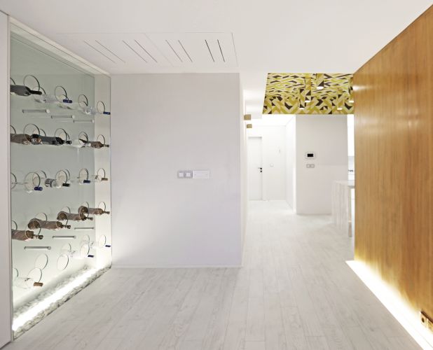
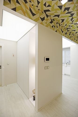
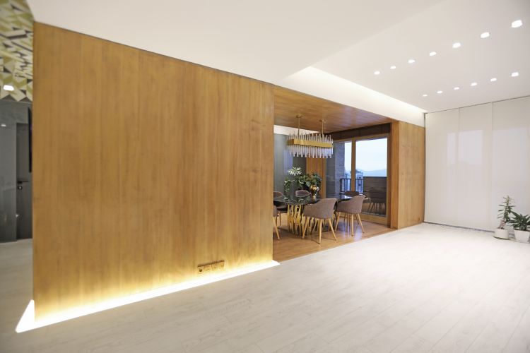
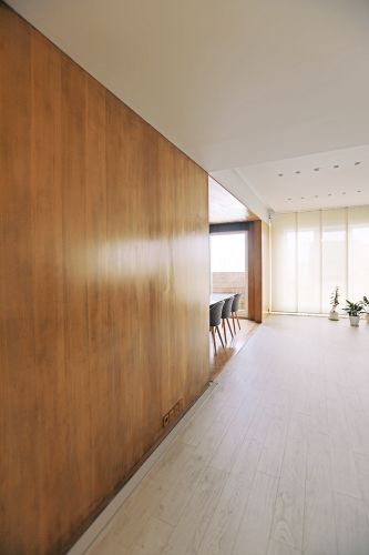
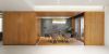
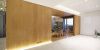
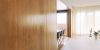
We started here, removing one of the rooms so that it would have access to the terrace, along the lounge and provide access to the kitchen. One of the sanitary facilities was right in the middle of these spaces, which could not be removed for installation reasons. When we lined the floor and ceiling and the dining room walls to both emphasize and warm up the space, we saw the outer wall of the annoying service as a whole, an integrated wooden box in the center of the space. Now, the wooden box worked with the terrace, adjacent to the lounge and kitchen, and resolved the intrusive service.
-
Read More
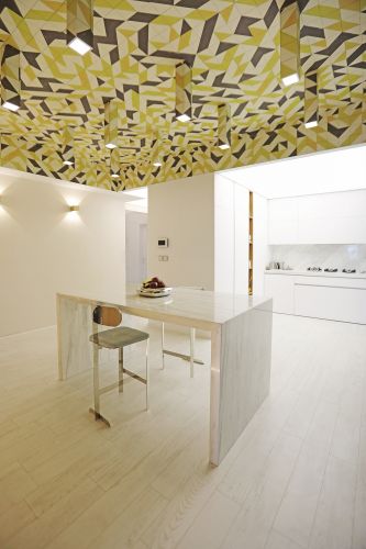
In the terrace, which was adjacent to the dining area, we used the appropriate wood outside to maintain space.
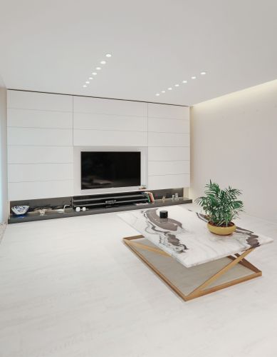
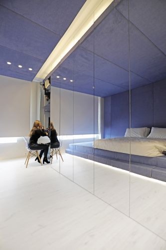
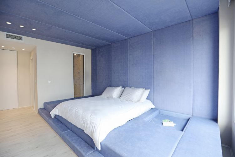
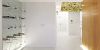
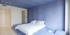
The overall layout of the single space was white and unobtrusive to provide the perfect visual balance for color spots such as the wooden dining room and bedroom where we integrated the blue bed with wall and ceiling. To make the bed more functional than the bed, we saw it as an entire platform that extends to the wall and ceiling. The mattress and two holes for the book and the magazine are empty. We covered our seating with a layer of foam and fabric to make it comfortable for bedtime reading.
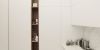
The young couple needed large and numerous closets in the master bedroom. The room was small ,so we used mirror all over the closet on the west side to make the room seems bigger.
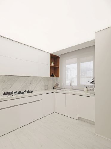
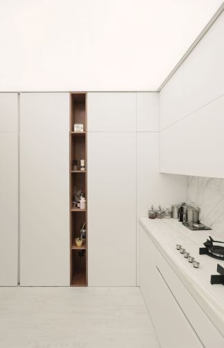
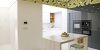
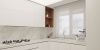
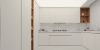
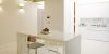
The kitchen and unit entrance that was attached to it were white and minimalist and of a single design and with both the elastic ceiling we drew on, it dissolved both low light and evolved into an integrated section.
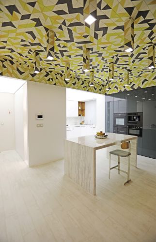
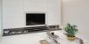
In our opinion, this house needed a beating heart, where we had to light it up, where we had a light partition, so we started removing the wall and removing part of the kitchen into this space. We drew and laid an island table in the center of it, now this space was no longer just a partition space, then we went to the ceiling, taking the ceiling here as high as possible; A number of these modules eject from the shell and light shines into space. This light colored shell, in contrast to the white walls of the unit, changed the nature of that dead space into a pulsating heart that, as witnessed by the employer, both themselves and more guests gather in this space.
Diagrams