- Home
- Projects
- 599 Villa
- A Surfers Villa
- Concrete Sewing
- Farbod Office
- First Home
- Maya villa
- Office for A Bussiness man
- Persia Khodro Boutique
- Razi Petrochemical
- Villa In Front Of The Garden
- Terrace Park Tower
- Third Millenium Towers
- A House For Two Generations
- Reflection Office
- | Free Roof | Summer villa
- Dehkadeh Iwan
- Caravanserai Recreation & Tourism Center
- Atmosphere Sea House
- Awards
- About
- Contact Us
VILLA 599
-
Summary
-
NIMA MIRZAMOHAMADI
Khaneh Darya town , Mazandaran – 2013
650 m2
Residential
Built
 Credit : Finalist of Memar award , 2014
 -
-
About
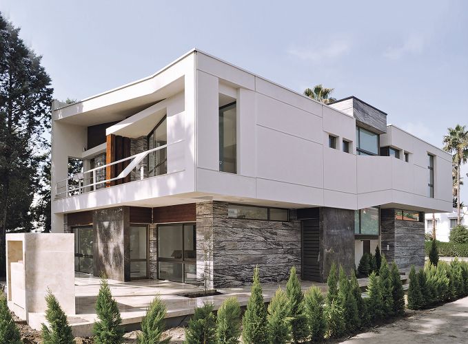
Villa Number 599 is located in the coastal town of `Khaneh Darya´ (between Mahmoud Abaad and Sorkhrood provinces) in a land with a ground area of 623 square meters. What the contractor had in mind was to demolish the old villa and replace it with a new structure. The initial visit to the sight was done in May 2011 and the design process lasted up to October of the same year. Due to weather condition, the construction and building of the project began in June 2012.
When we talk of designing a villa, the general consensus is that an architect is less restrained to exercise his extravagant ambitions and to propound his special ideas, but many restricting laws and regulations in towns are so that maybe designing a villa is considerably more challenging. Because firstly the architect is presented with regulations and planning instructions and secondly he needs to satisfy the client’s expectations of a villa.`Khaneh Darya´ coastal town is of those towns with a thorough planning instruction that consists of the building location, allowed height, occupied surface and the substratum. Among these, the building location (a 10 by 18 meters box), allowed height (7.5 meters up to the highest point of the roof) and the minimum opening space to the neighboring area made more constraint on the design. Therefore the adopted approach had to use methods that were within the simple and conservative framework and at the same time committed to the regulations.
Solving climate issues and a new definition of sloped roof, evading the classic pyramid shaped villa, providing adequate lighting to the center of the structure considering the northern-southern protraction and providing acceptable view plus the aforementioned restrictions were challenges that influenced the initial design concepts. The contractor’s wishes were also discussed; the most significant issue for him being performance, permanence and ease of maintenance. Because he had infrequent and seasonal use in mind and it also seemed his children were the main target of the project.
-
Read More
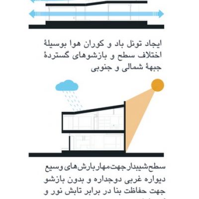
With such emphasis on permanence, considering the environmental attributes of the Mazandaran province coasts was vital from the very beginning and sloped roof, the building sitting on plate, using huge openings through the northern-southern axis in the direction of air flow, view and light absorbance and also choosing building materials appropriate to the climate, were placed as the defining elements of the design frame.
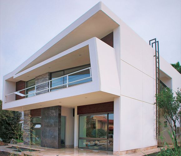
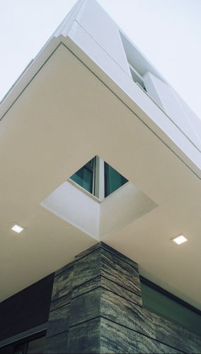
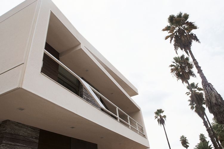
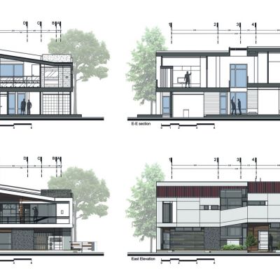
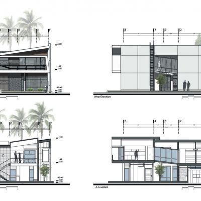
Since there was no escaping the sloped roof, we made the decision to exhibit a different definition of it and avoid 2 or more sided sloped roofs. Therefore we separated the first mass of the building from the ground and created a continuous surface in the form of a folded sheet from west to east and entwined around it so the minimum required gradient for the roof (15 percent) was also safeguarded.
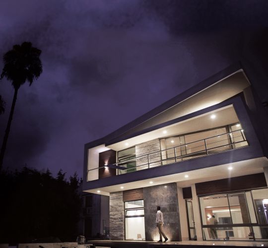
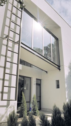
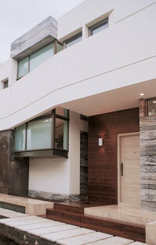
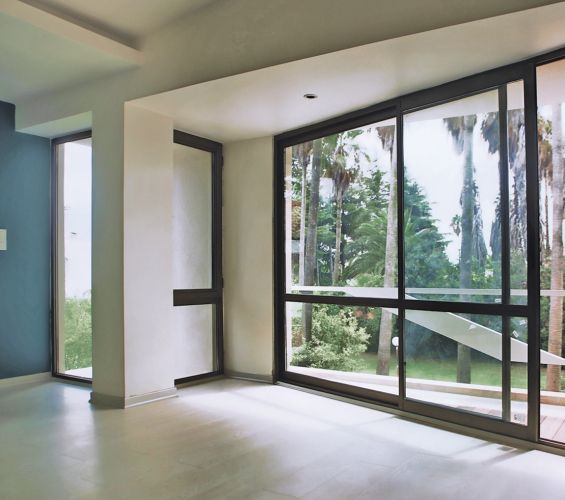
The ground floor which has mostly glass partitions, sat from the perimeter to the inside to add to the suspense of the upper volume and also to solve the regional climate issues.
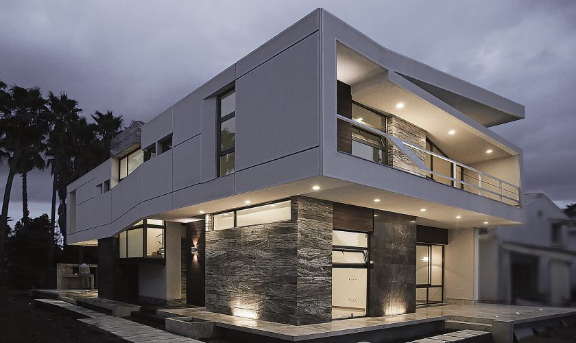
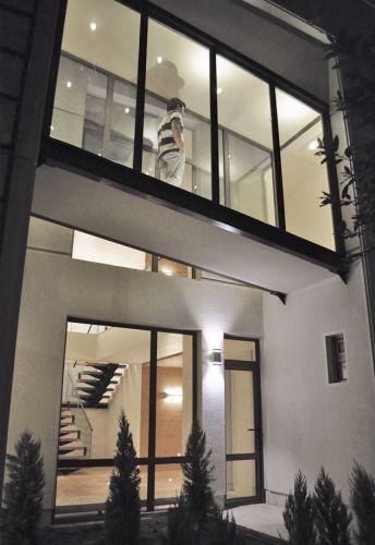
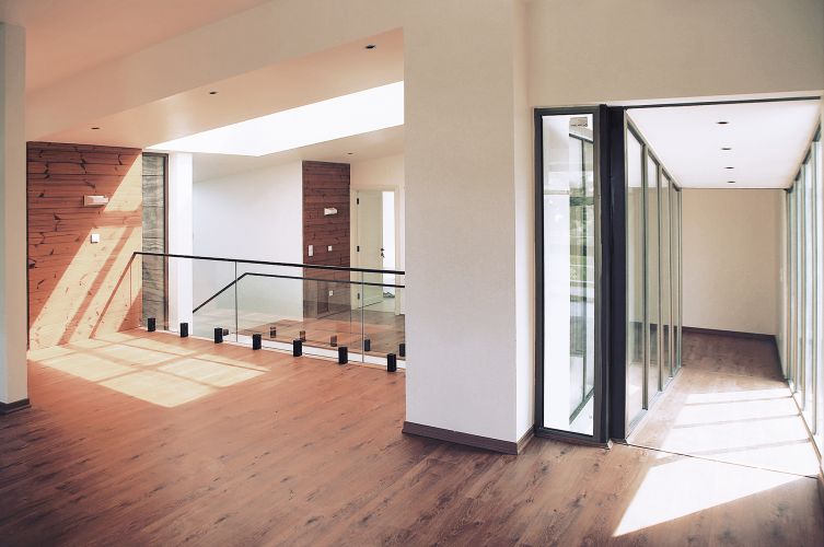
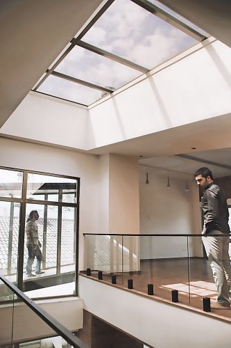
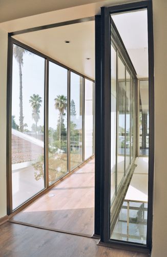
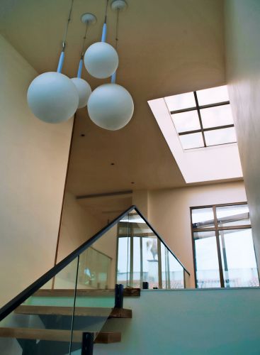
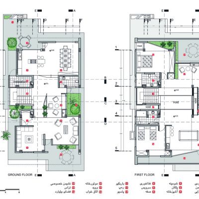
The design continued from sections and the mass of the building, so that it is less compressed, was broke in length. As a result the first floor was divided in two by a void. Afterwards in order to repeat the skewed roof lines along the longitudinal section of the building and to intensify draft the upper section is located higher than the lower half and for a pathway between the two we passed a roofed slope outside the main structure and over the western patio. This method’s achievement, which is the only section connecting these two halves through what is similar to a sloped glass bridge, is significant to the project. In addition, the placement of a skylight over this void and the occurrence of light and shadow dancing throughout the day in the center of the structure, has created a magnificent visual quality for this coastal villa.
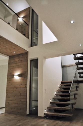
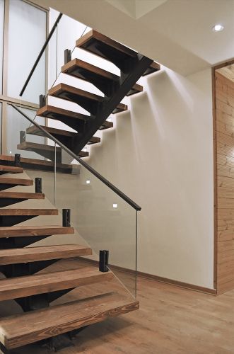
Providing vertical circulation is accomplished through the ramp which is located in the glass box between the northern and southern halves beside the vestibule. And so vertical and horizontal circulation are both achieved in the center of the building on two sides of the void.
In drawing preliminary diagrams two points were considered:
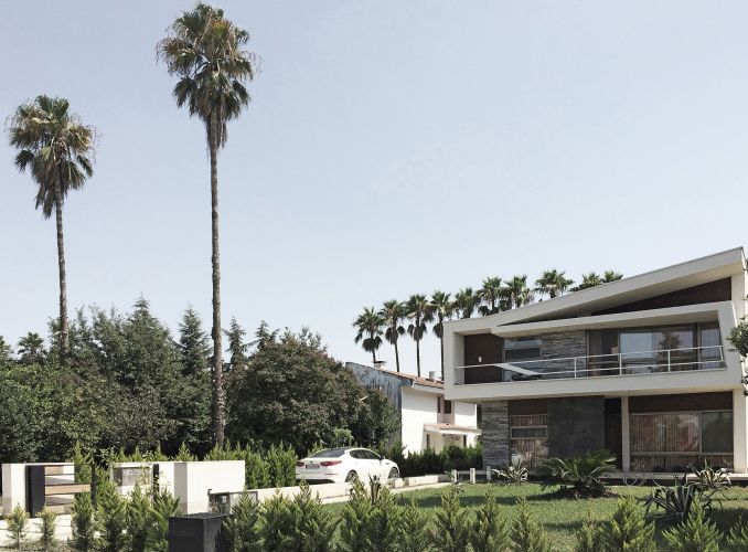
- Continuity of space inside and out; as it is expected a fitting connection with the outside of a building in a promenade villa; retreat and transparency of northern, southern and eastern glazing in the ground floor and Opening track access to the yard, In addition to separating the building from the ground and inducing a sense of suspense also responded to the proposed demands. The green corridor with two rows of palm that is located to the south of the building has been one of the impactful forces in design which lead to the design of the large first floor terrace and also the placement of the main room facing the palm trees. This terrace and the northern one with their open spaces connect the inside with the outside.
- That we follow a different approach to the common organizing of two-storey buildings in which private areas are located on the top floor and the rest on the ground floor. In this respect, after reviewing multiple options, by placing the pool table space and the bug southern terrace in the first floor, we both moved the stream of life there and also provided a great view to the peripheral landscape.
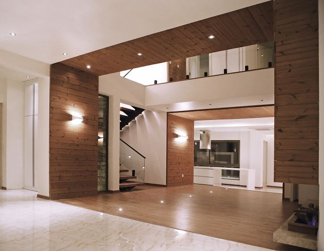
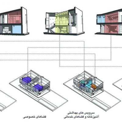
In the first floor, the service sector was placed in the center. The entrance, kitchen, staircase and the bathrooms are all located here to achieve a proper access diagram. The two north and south sections are envisioned for dining, living room and television room.
- Non-permanent use of a coastal villa, resulted in the design policy considered so that it would create a vicissitudinous spatial and verbal sense, both to the living environment and the surroundings; so that every time a change of location coordinates would cause the possibility of experiencing a different spatial quality for the audience. This would also be a motivator for a move from an urban home to this villa.
- Creating a spatial environment continuous of the green background, in a way that it seems the entire structure is a part of that landscape and the surroundings which is only covered with a roof and a glass wall is stretched around it. The inside space is full of sunlight and frames of surrounding landscape during the day which absorbs life energy and shares it with the environment at night.
- Distinction and curiosity to discover space is one of the main points of this project. The existence of voids here and there, the glass ramp and the variance in height (of the two sections of the building) all point out to this. The bamboo tree which at the top reaches the main room through a small gap, and passing through the hovering glass ramp in morning light and the light which glows to the center of the structure form the skylight are special spatial experiences of this project. We realized through experience that all these, even for the owners who ad seen the design multiple time before, have created the sense of curiosity and space discovery.
- In this project, movement, access and circulation in the suspended and naked glass frames have become the spirit of life and blown into the surroundings.
- We tried so the overall building, despite the difference with the setting’s architectonic texture, is not conflicting and that it gives a coastal villa vibe. Even though nearly all villas in the north have not stayed true to the usual pyramid system and angled roofs, it has also achieved coordination with the setting despite also being absolutely distinct.
- Adequate spatial legibility and ordering, so that service spaces are located at the center of the plan so that access from both southern and northern wings is established by the least distance and circulation and easy dialogue between service and accommodation spaces.
- The continuity and protraction of inside and outside space and their incursion into one another. This was achieved with sharing construction material the movement of outside layers into the depth of interior space in form of light gaps and also by planation entering the inside of the structure.
At first the structure was supposed to be concrete with repeating wall incisions so the pillars are eliminated from the first floor and a concrete sandwich is extruded horizontally. But midway through the design process, in accordance with the contractor’s wishes to control costs and simplicity in execution, it transformed into a mast pillar concrete structure. In order to exclude the walls pillar dimensions increased and we ensured they’re all placed in the walls. The maximum protrusion on the first floor is 2 meters and the final roof is in form of a skewed composite mast and metal profiles with final sheet covers. The staircase and slope are in form of additional steel structures connected with the concrete.
To provide cooling and heating fan coil packages are prepared which have built-in roof panels. To escape the visual pollution of coolers this was of special consideration to us.
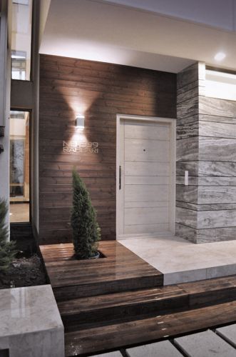
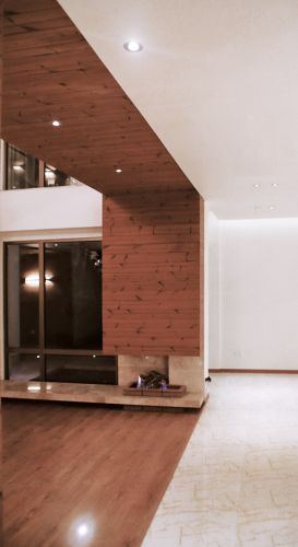
The main proposition here was the continuation of materials from the outside to the inside and also the use of materials that were harmonious with background textures and also to avoid plurality. For this, saturated wood was our best option, because it has great durability outside and was in line with the overall façade of the project. Stone was also one of the materials used on the outside and inside. Considering the project’s concept, glass and dark materials were used extensively on the ground floor so it would intensify the pendency of the higher space in for of a contiguous white frame.
