A House For Two Generations
-
Summery
-
NIMA MIRZAMOHAMADI
No 4 , Nasrin st , AzarMina st , Farmanie st ,Tehran, Iran-2021
330 m2
Residential
Built
 Credit :
Winner of Architecture Masterprize 2022 in interior design
Winner of 3rd place of Ninth Iranian National Interior Design Award
Winner of a special badge for the best use of materials from Ninth Iranian National Interior Design Award
Winner of a special honorable mention from the 14th Iranian Architecture Award
-
-
About
That people from two generations with different and somewhat distant attitudes and desires live in the same house, and all the while they each believe they belong to that house and there is a good feeling between them and their home was all we were looking for in this project.
Mehrad is an up-to-date young man with a modern outlook who sees dynamism in simplicity, as opposed to his parents who seek peace and find it in details that have a sense of the past. They see the house as a sanctuary of warmth and details whereas Mehrad is simple and practical.
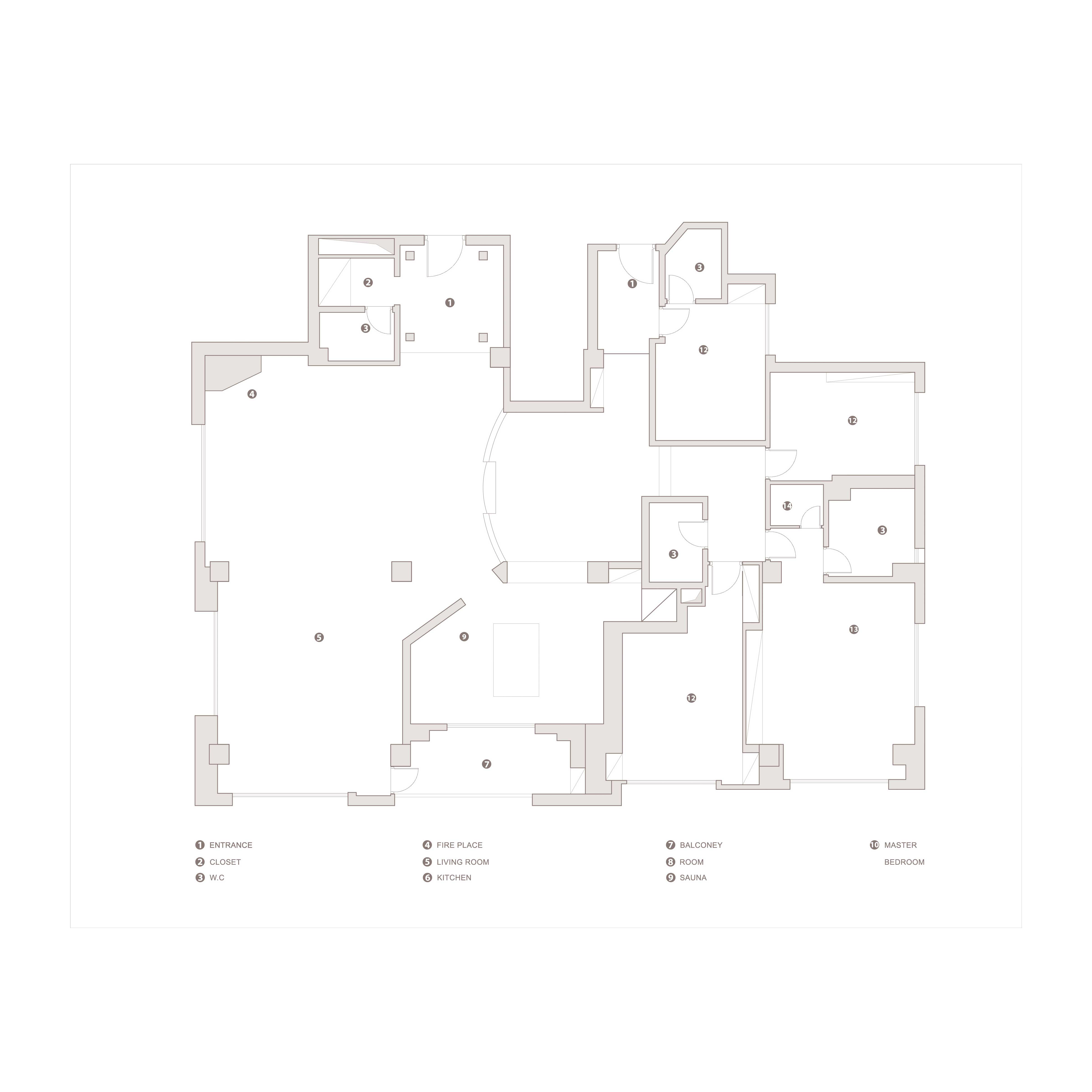
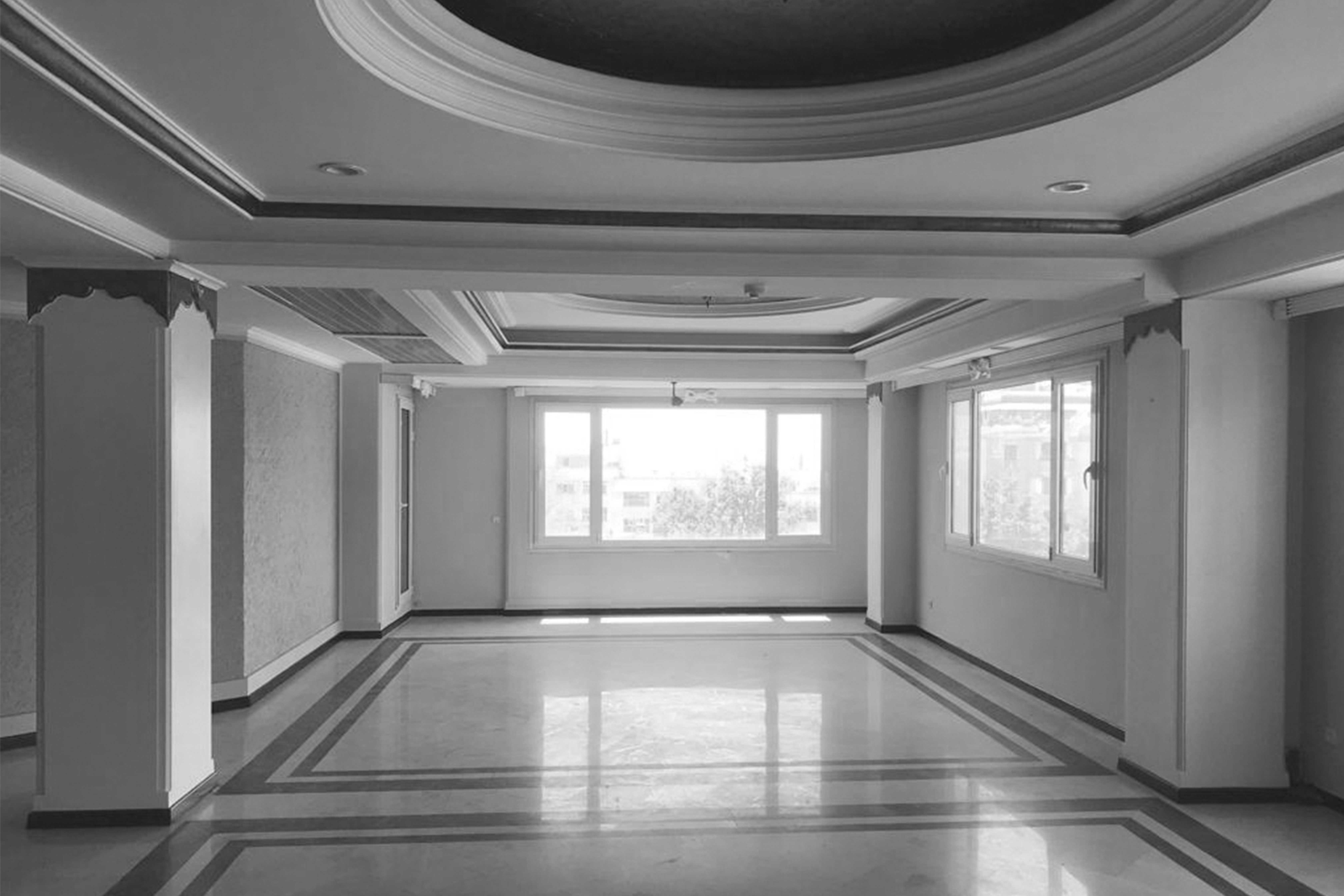
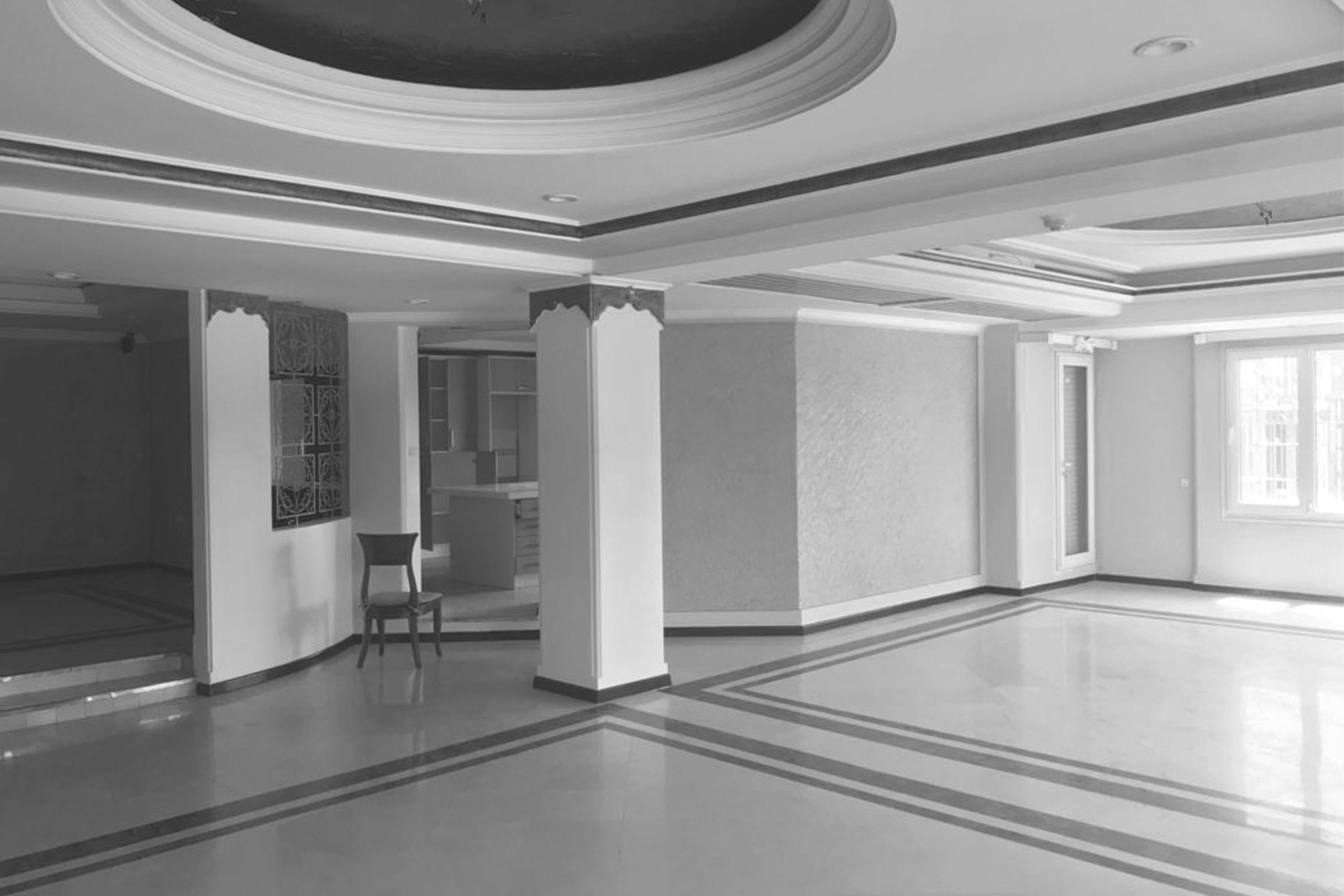
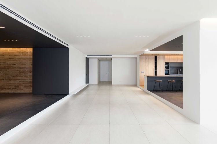
The old apartment of about 330 meters was designed by one the most prominent architects who specialized in the so-called Roman-styled facade. It is strangely fraught with additions and omissions; both in form and plans and also in details and decorations, abundant with contrasting meaningless levels, circles, squares, useless corners and even false columns! So much so that removing all these additions became an arduous process and the design was revised several times.
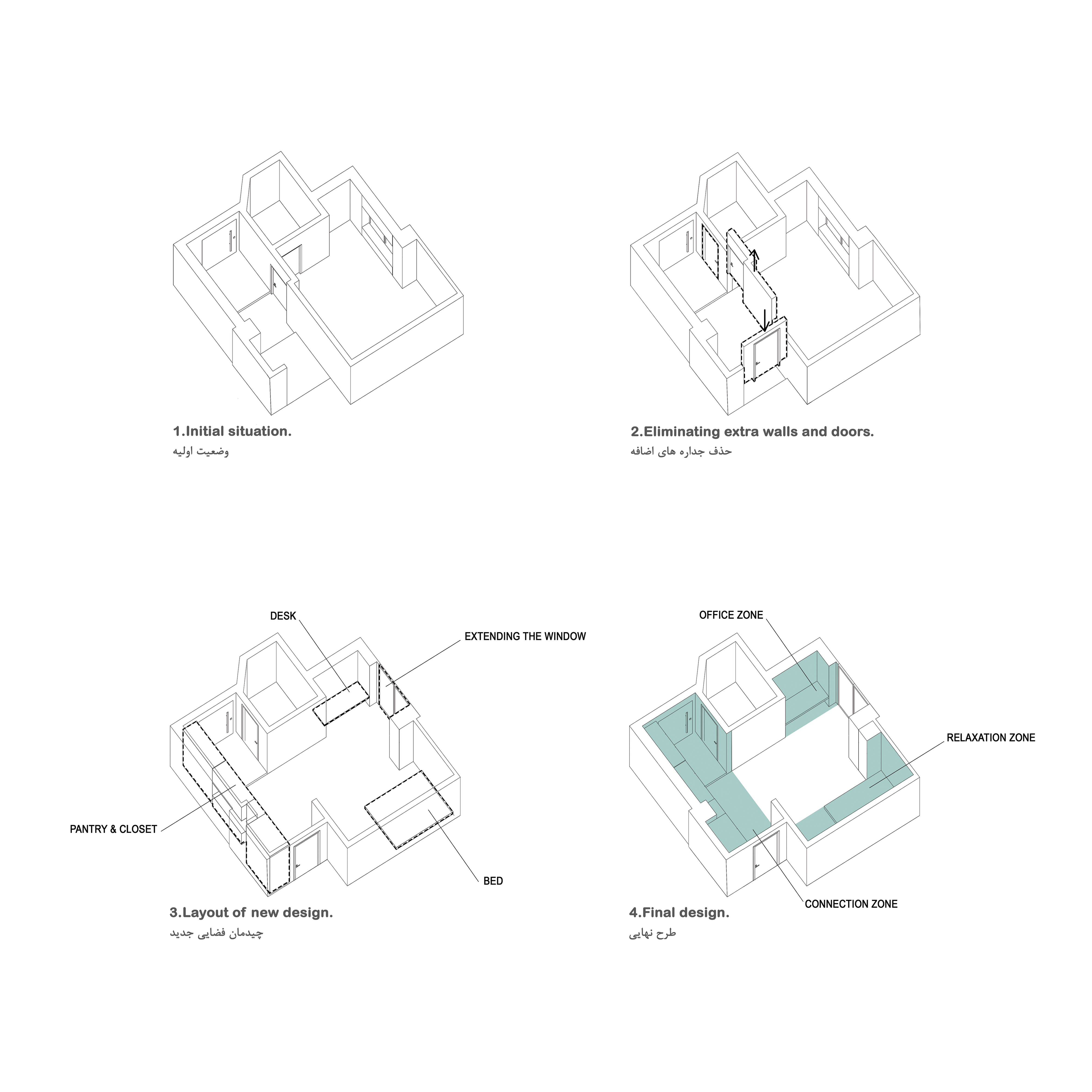
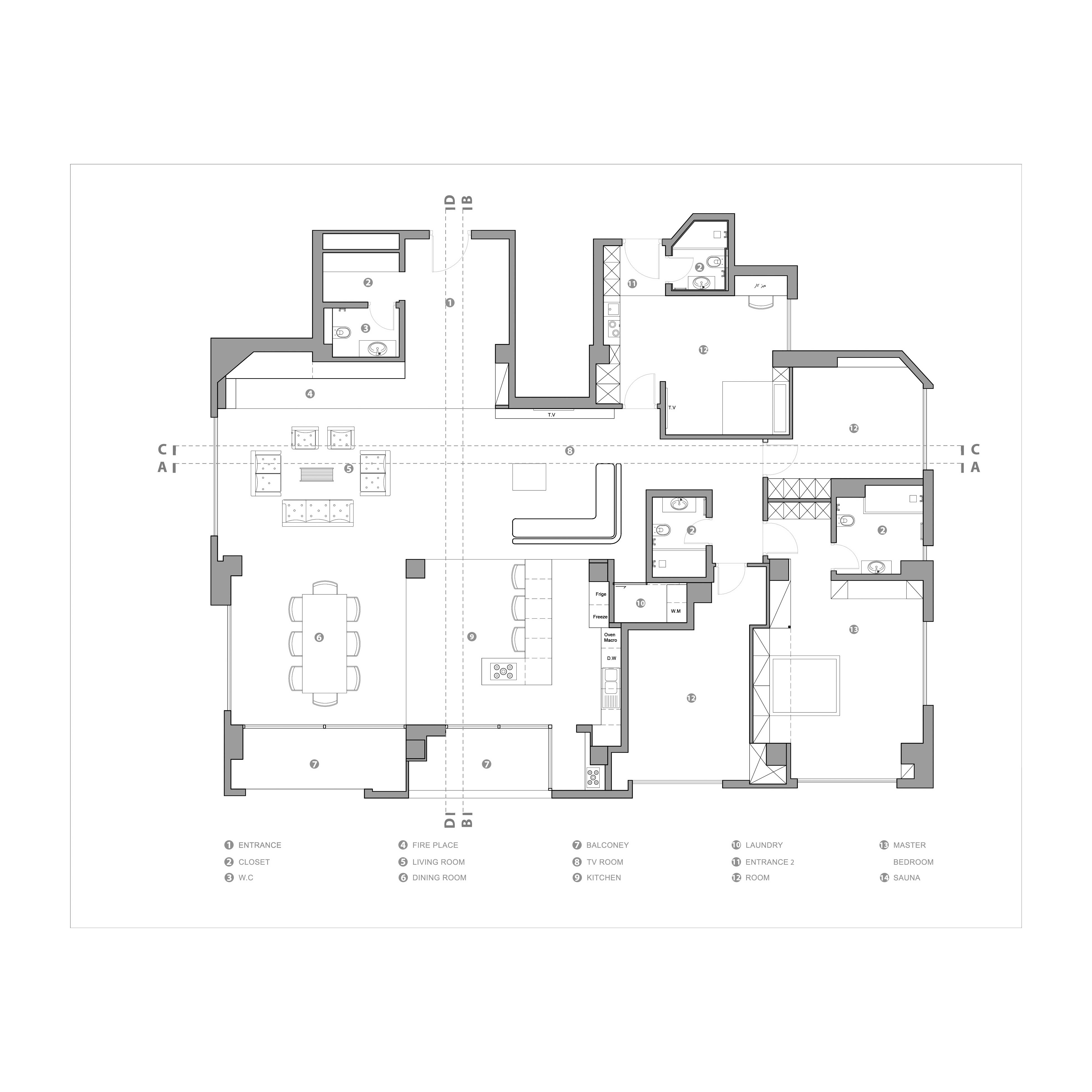
The most important immutable remains were the columns between the halls and the level split between the entrance and part of the kitchen and toilets, which, due to the passage of ducts, could fundamentally not be moved.
-
Read More
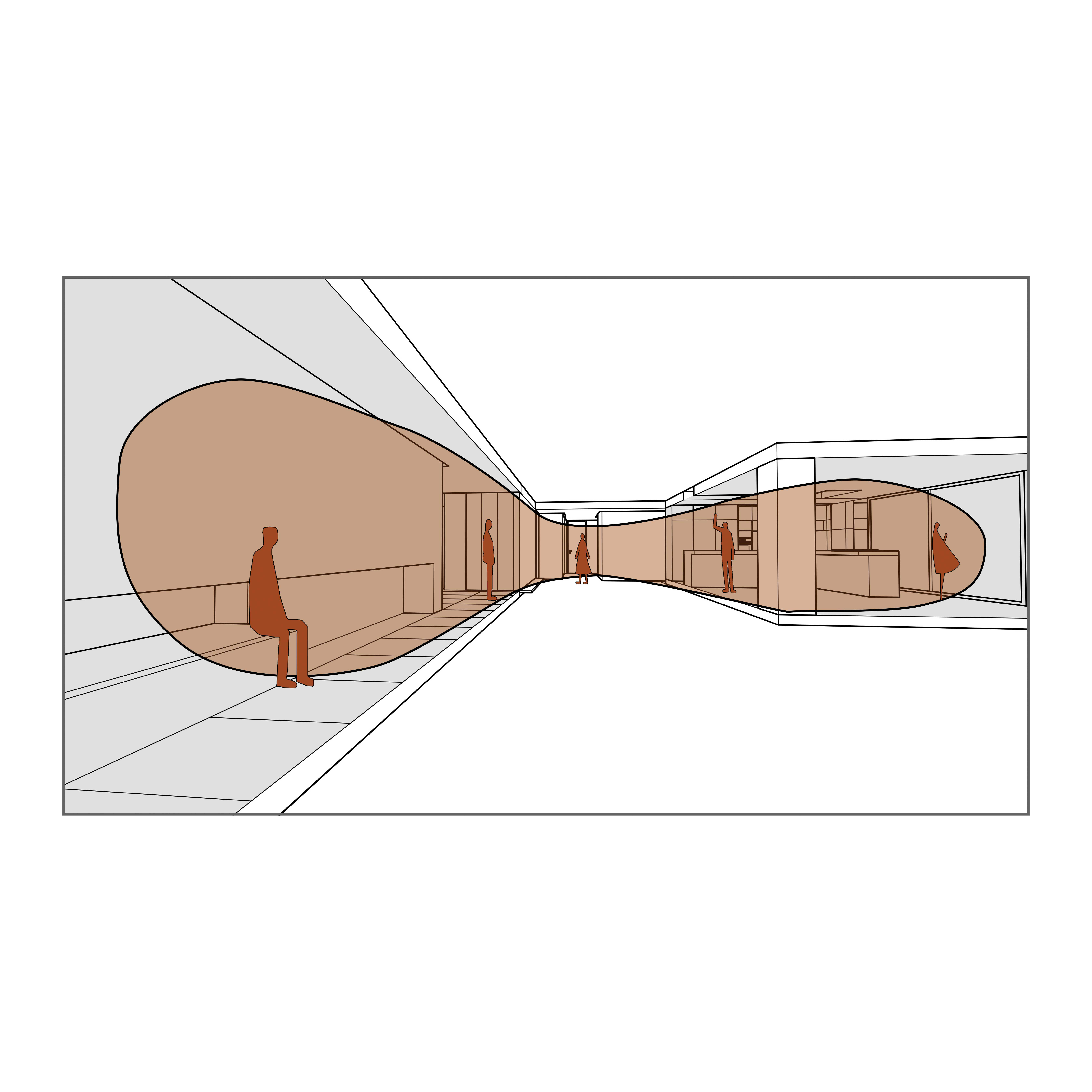
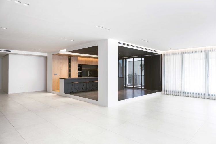
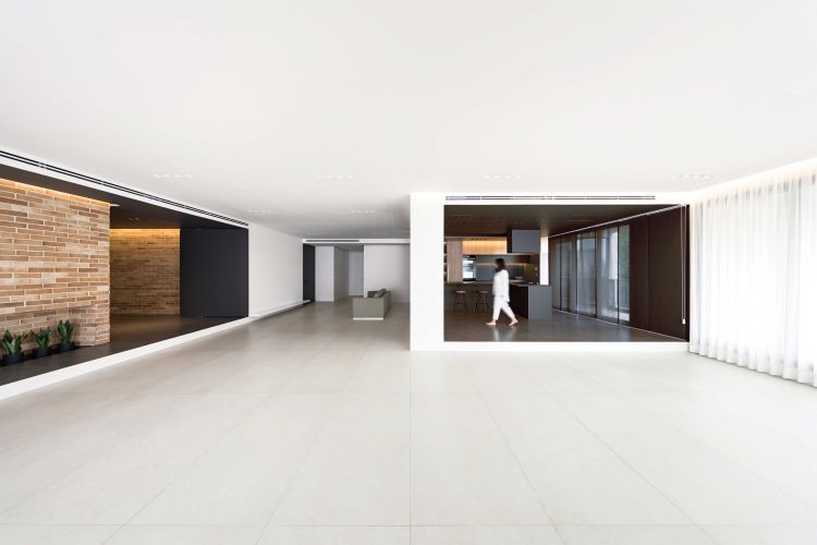
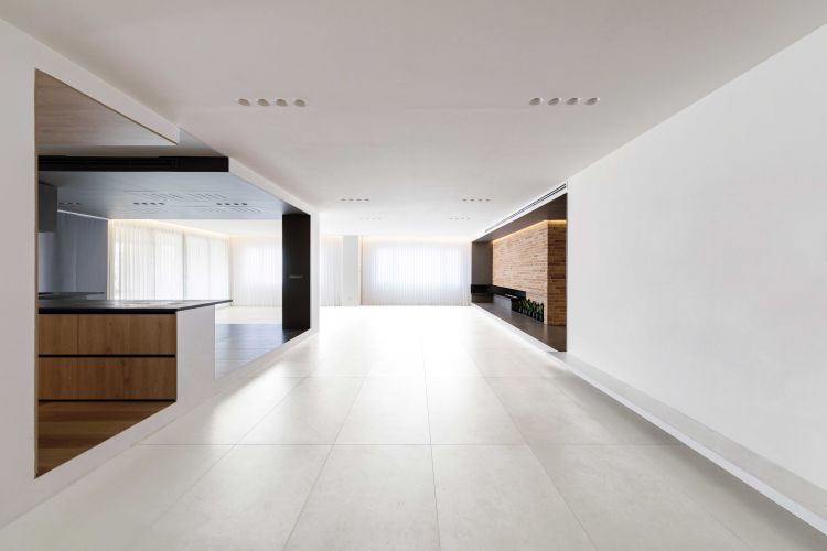
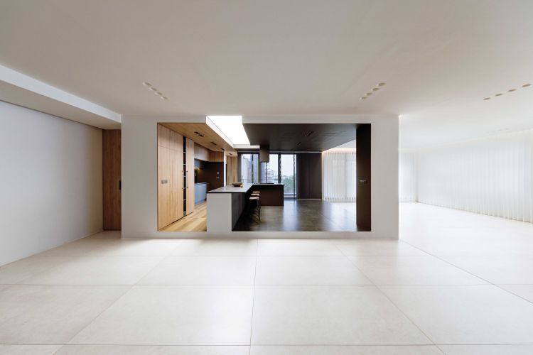
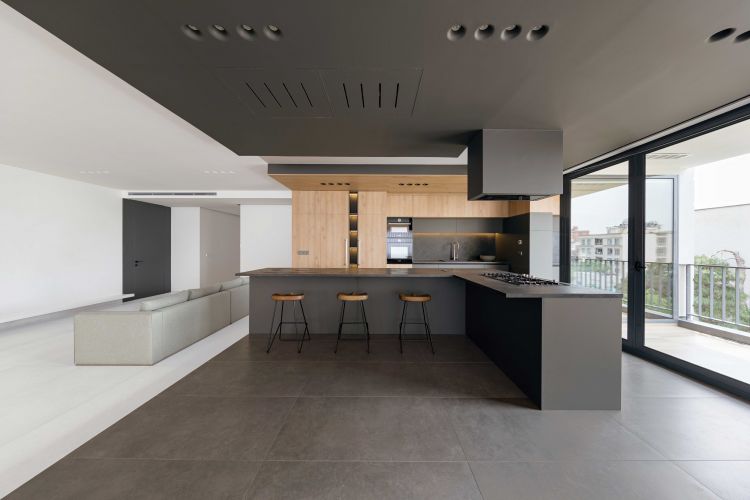
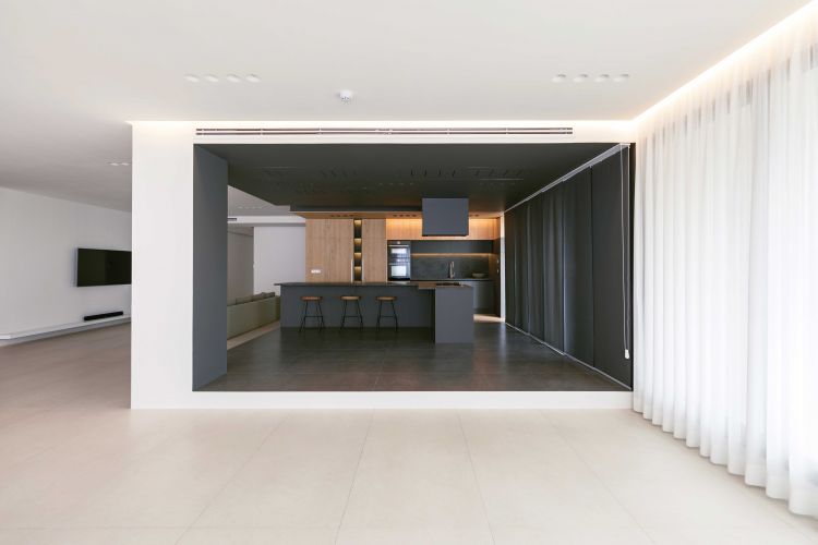
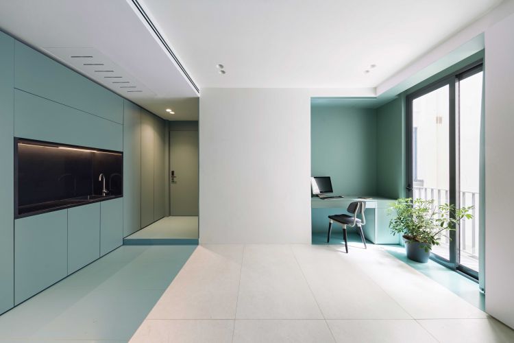
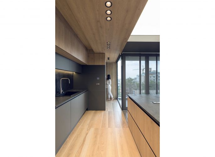
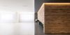
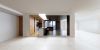
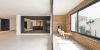
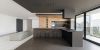
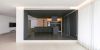
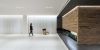
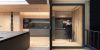
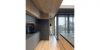
The main idea took shape when we decided to change the middle column and the level split to create a box in the corner of a white shell that houses the kitchen and dining room next to the terrace; a white box containing a combination of a gray dining area and a wooden kitchen that evoked a joyous feeling for Mehrad's mother. The laundry was also placed behind the kitchen to put more emphasis on our box.
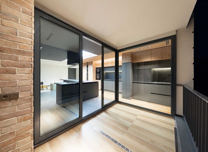
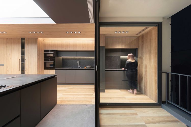
The cooking area is actually an extension of the kitchen that stretches to a corner of the terrace with a glass wall, which has good visibility and light and also works well with the terrace. The counter and the light ceiling above it also seem to be a cut-out part of the white body of space.
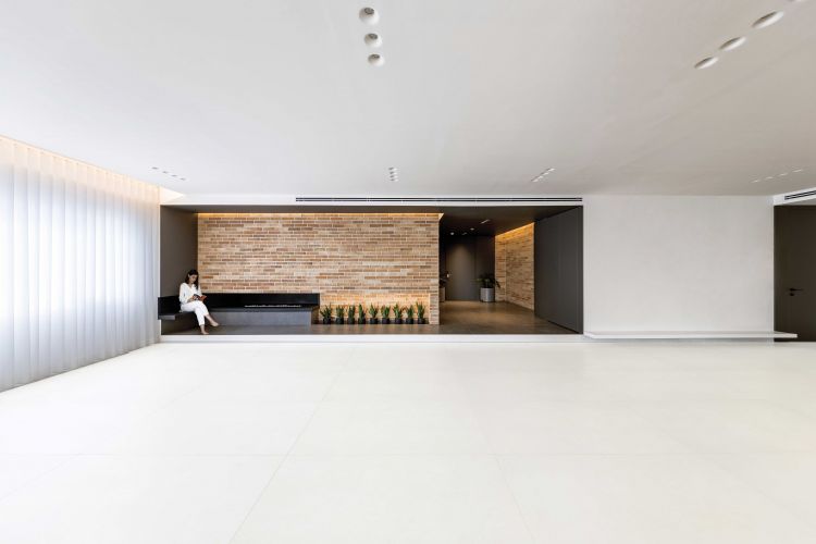
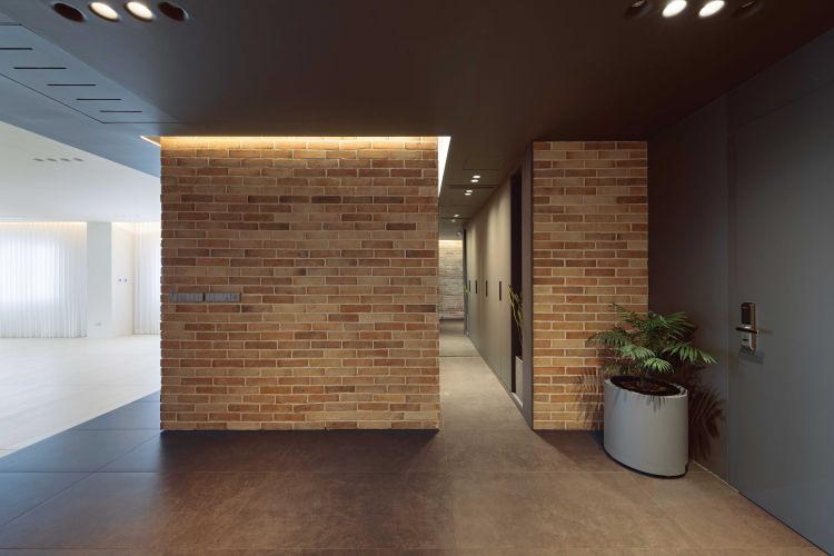
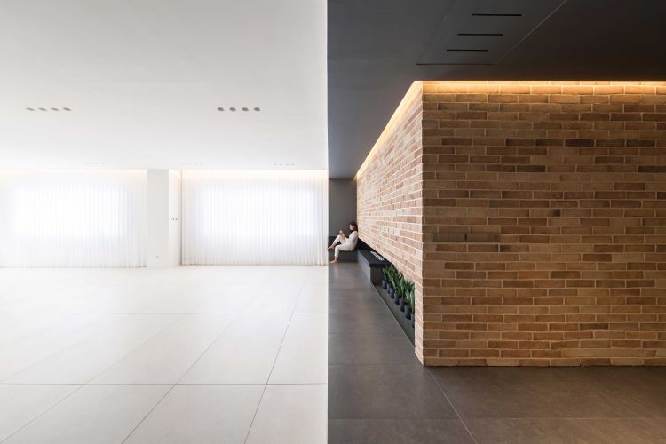
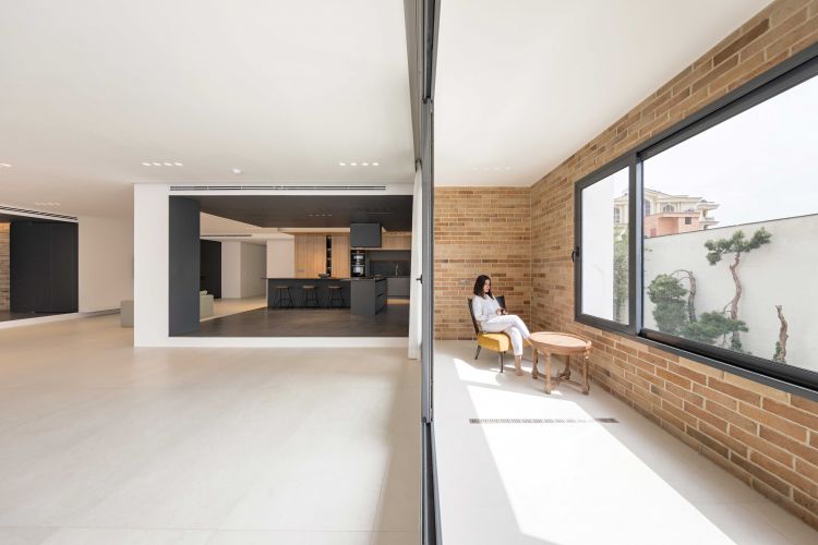
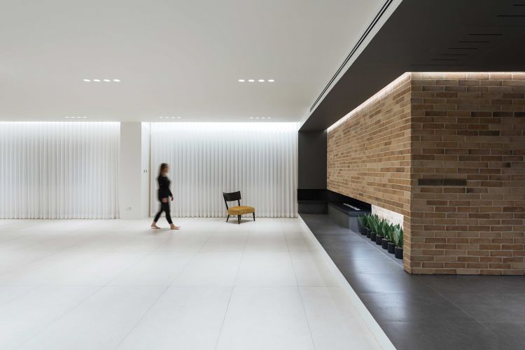
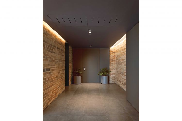
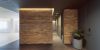
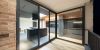
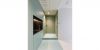
We approached the main entrance with the same outlook. We paired the stairs, roof and the edges as if they were excavated from inside a white shell. The inside of this area is also gray, but in combination with bricks. The brick that Mehrad's father loved very much, which exuberated the same feeling of the past that he pursued, a hand brick, rough and with the traditional arrangement. We also included the fireplace in the same complex with a small bench next to the flame and the plants lined up.
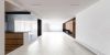
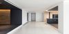
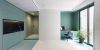
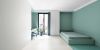
Therefore the spaces we have explored from the heart of the white background are facing each other in a significant way and have established a constant and fluid dialogue in the environment, a dialogue that also encourages residents to be in different spatial situations.
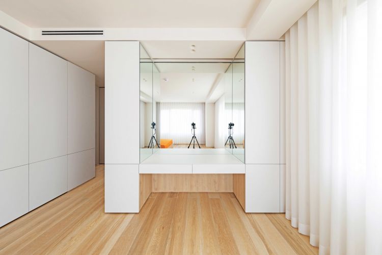
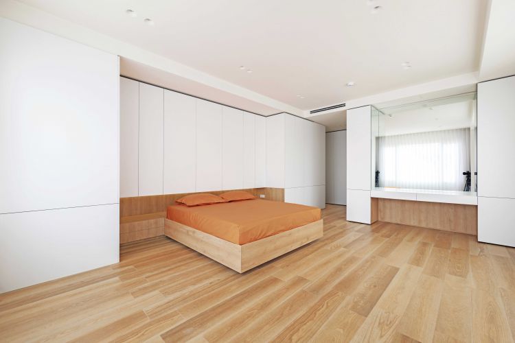
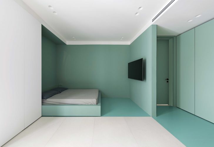
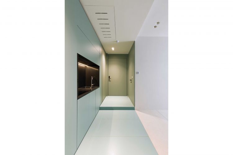
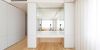
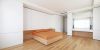
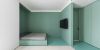
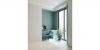
Now it was Mehrad's turn. We also gave him an independent box. The position of this box is such that on one side it has an axis that connects the single side door to the access door of the hall space. Along this axis, cupboards and pantries were placed in the heart of the wall to maximize the use of space.
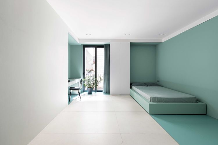
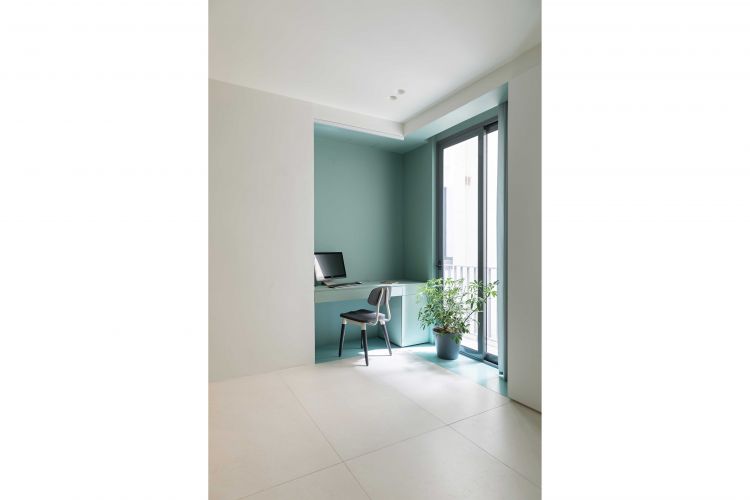
The main space of the suite is on the other side of this axis, which also has a small window. We enlarged the window both in width and height as much as possible and placed Mehrad's desk next to it so that we could get the most out of the sun. The bed was placed on the other side of the desk to get the best arrangement. Mehrad loved blue-green, so like the rest, wherever we dug the white body, blue-green came out of it.
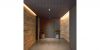
From our point of view, a unit of this size needed more of a half-open space than the existing terrace next to the kitchen, so along the same terrace, we added a terrace on the south side of the hall, which, thanks to its large window and brick walls, worked really well.
Diagrams