- Home
- Projects
- 599 Villa
- A Surfers Villa
- Concrete Sewing
- Farbod Office
- First Home
- Maya villa
- Office for A Bussiness man
- Persia Khodro Boutique
- Razi Petrochemical
- Villa In Front Of The Garden
- Terrace Park Tower
- Third Millenium Towers
- A House For Two Generations
- Reflection Office
- | Free Roof | Summer villa
- Dehkadeh Iwan
- Caravanserai Recreation & Tourism Center
- Atmosphere Sea House
- Awards
- About
- Contact Us
reflection office
-
Summery
-
NIMA MIRZAMOHAMADI
Units 722,723,724 , Atlas mall , Niavaran st ,Tehran, Iran
– 2021
380 m2
Office
Built
 Credit :
Bronze Winner of the IDA Design Award, ‘Reflection Office’ project, , 2023
Finalist of the 10th National Contemporary Iran Interior Design Award - 1401
Finalist of the 15th Iranian Architecture Award - 1401
-
-
About
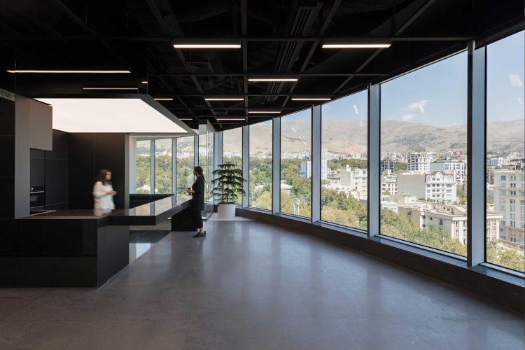
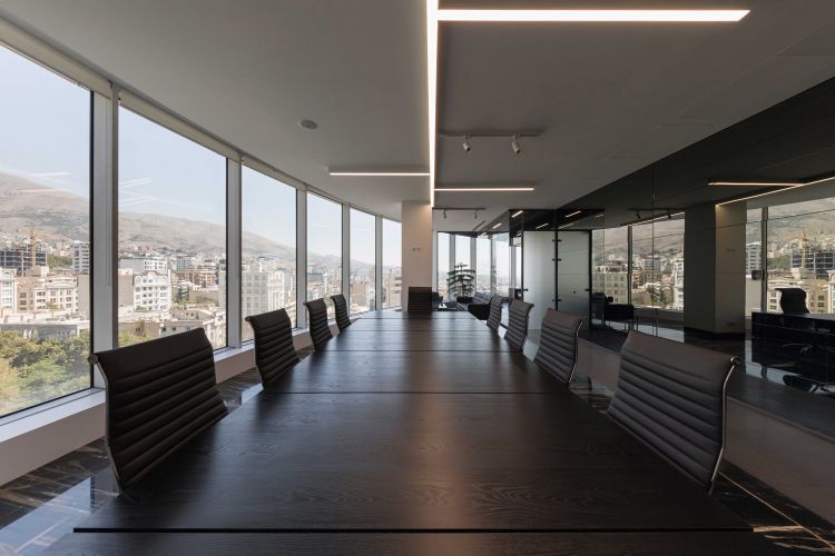
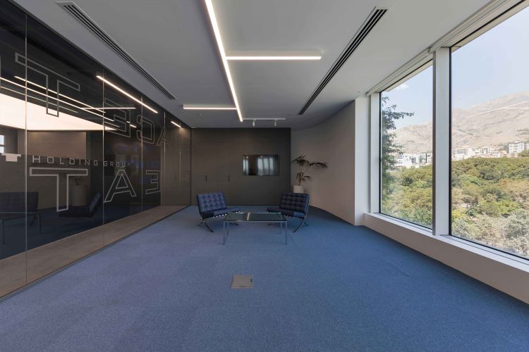
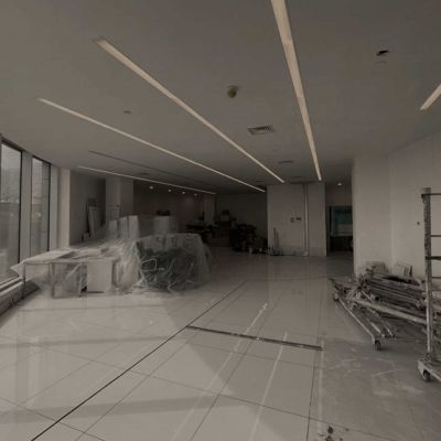
Tall windows on the seventh floor, facing the park and Niavaran Palace, which, due to the slope of the park and garden, seem to be located right in front of these offices.
This was the first thing that caught our attention when facing this project.
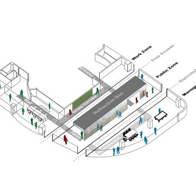
There was something else at work, three units that had to become one, three units stitched together in a hard L shape, and because we had to see the main entrance from the western unit, connecting it to the other two units should have a juncture to separate the area of the manager and clients from the area of colleagues, and at the same time, the manager would be placed in a central position as to be approachable and also able to oversee everyone's work!
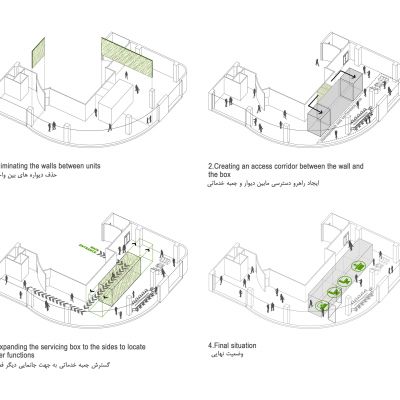
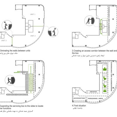
But the problem was that for a strong connection between these units, the previous toilets and pantry that were attached to the wall were hindering.
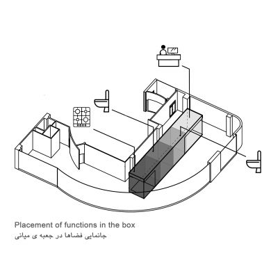
It was here that the idea of an elongated box to be placed in the middle of space crossed our minds. Therefore we removed the
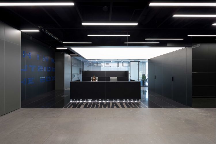
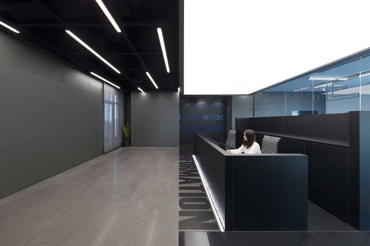
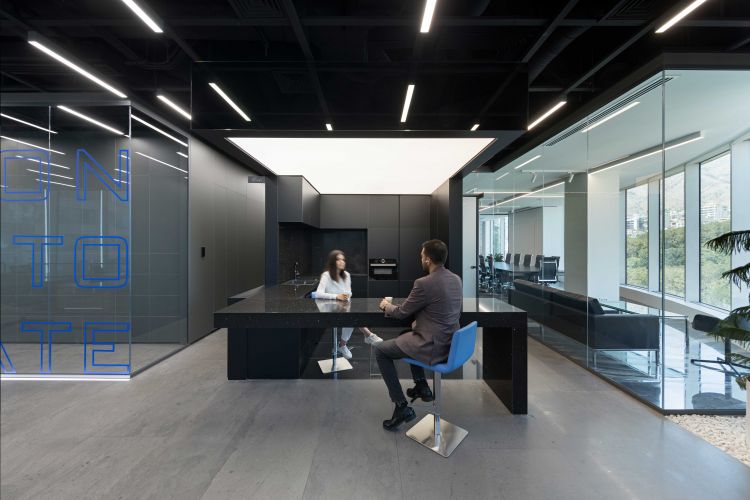
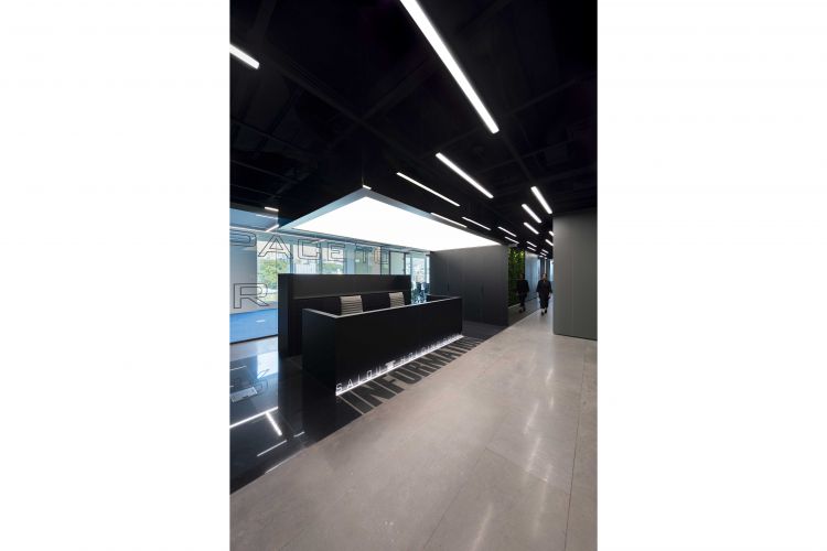
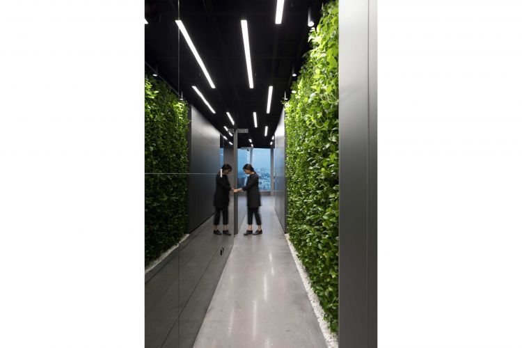
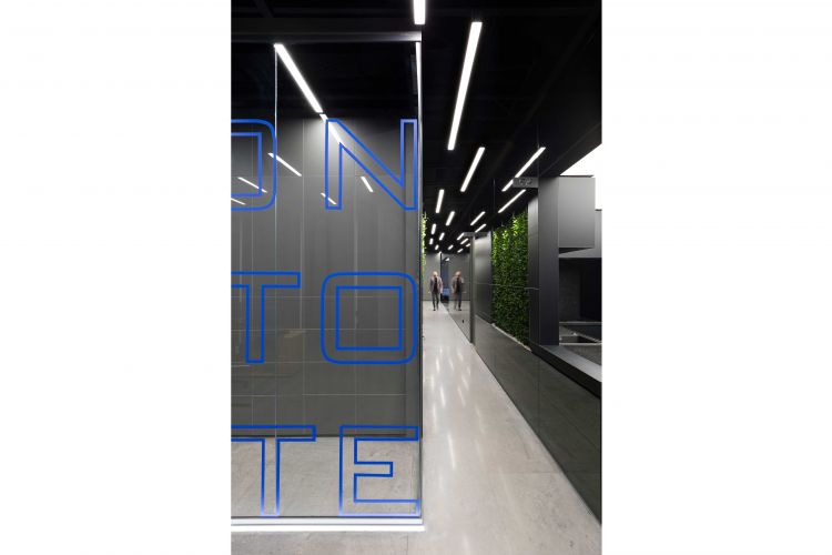
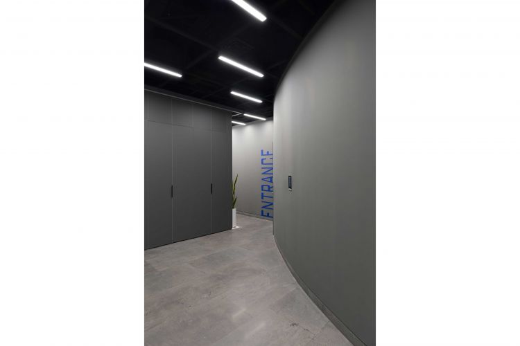
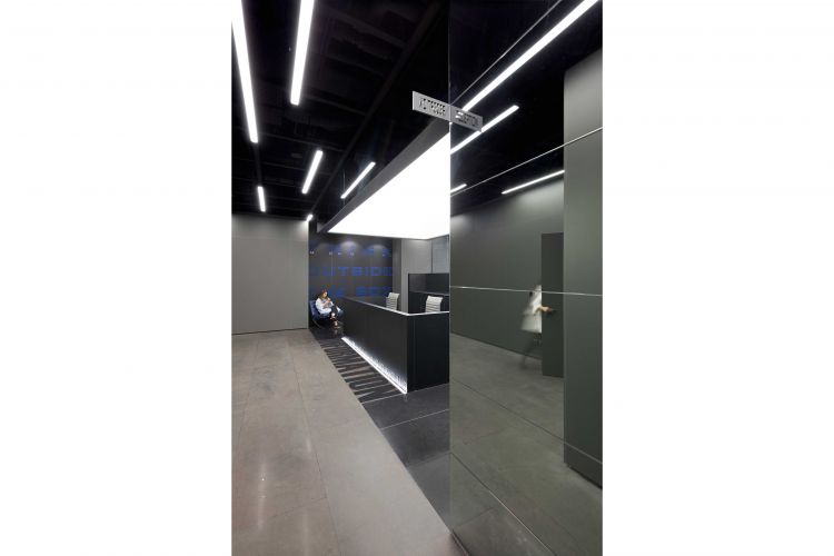
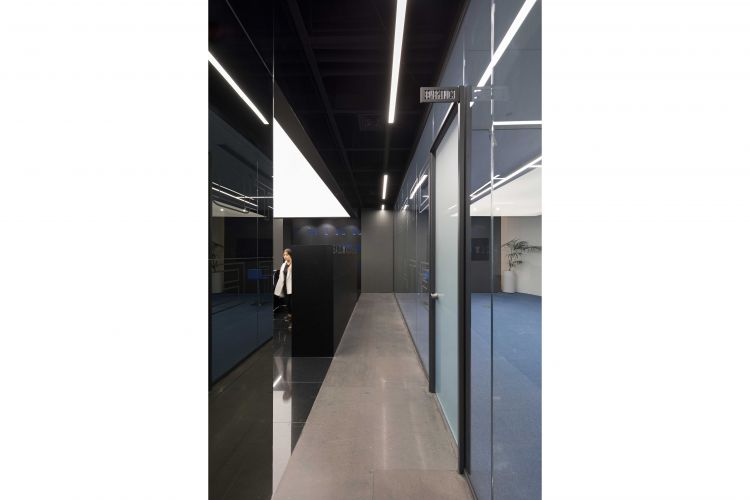
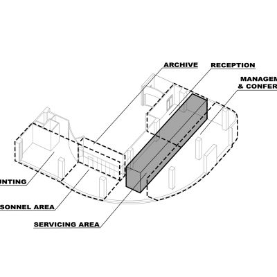
pantries and toilets from the southern wall of the units and separated them to create a corridor. This corridor connects the reception space in the west to the personnel spaces in the east without obtruding the management space in between. We arranged those toilets and pantries one after another and in one stretch to create a box in the middle of the space. At this point, we stretched our middle box as much as possible so that in addition to the service facilities, the reception area is placed on one of its western sides, and coffee bar and open pantry on its eastern side.
-
Read More
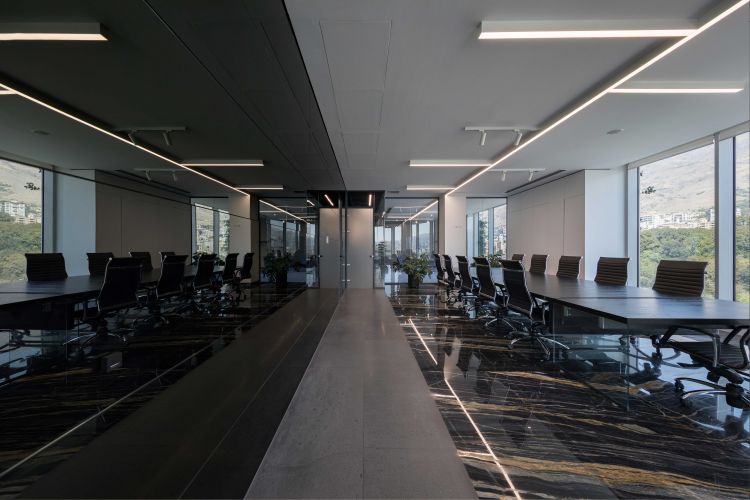
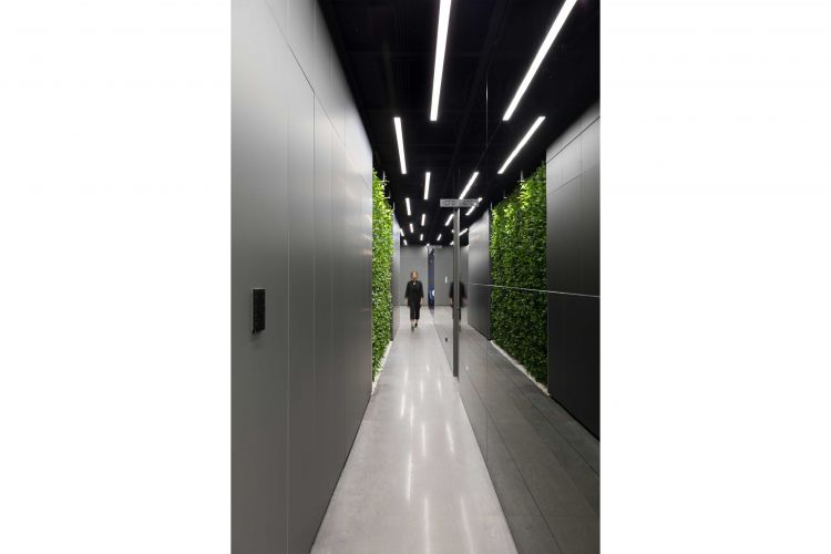
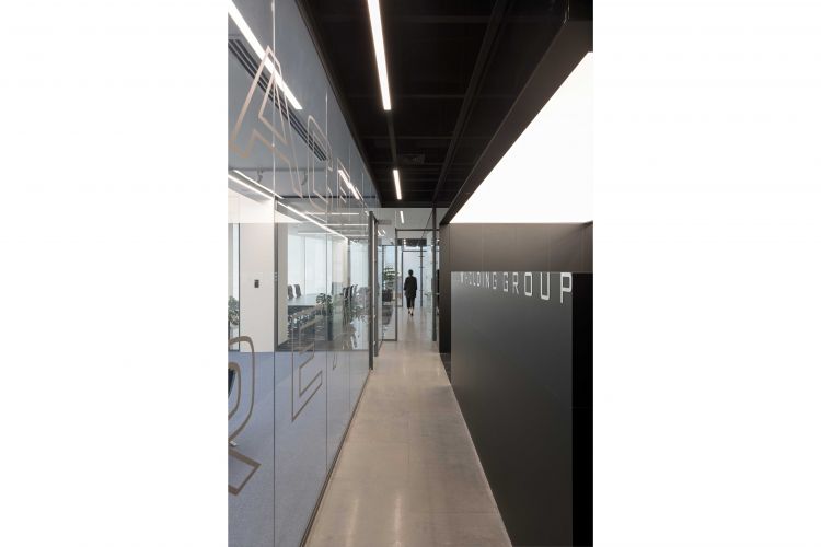
Now we had a box with a length of approximately 20 meters, which on the one hand contains most of the service and reception spaces, and on the other hand, the corridor adjacent to it has created a strong linkage between the spaces. This elongated box extends on both the east and west sides as a luminous and suspended ceiling, so that it is both light and readable.
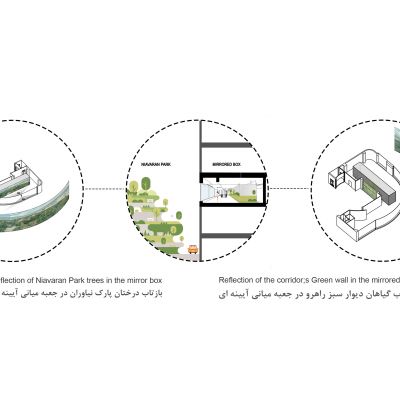
Three sides of this box faced tall windows with a view of the park, the palace and the city, so if we make the whole body of this box a mirror, both the / reflection / of the city and the park will flow in it, and its visual weight will be reduced. . This approach made the corridor between the box and the wall appear wider and more open with the reflection in the mirrors of the box. The mirror box, facing the north and the management space, is a reflection of the greenery of the park's trees, so in response to that, we also covered the southern wall of the corridor with vegetation as much as possible so that the corridor also reflects the greenery of the plants. In addition to purifying the atmosphere of the project, this approach doubled the good feeling of passing through this corridor.
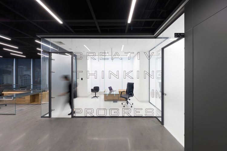
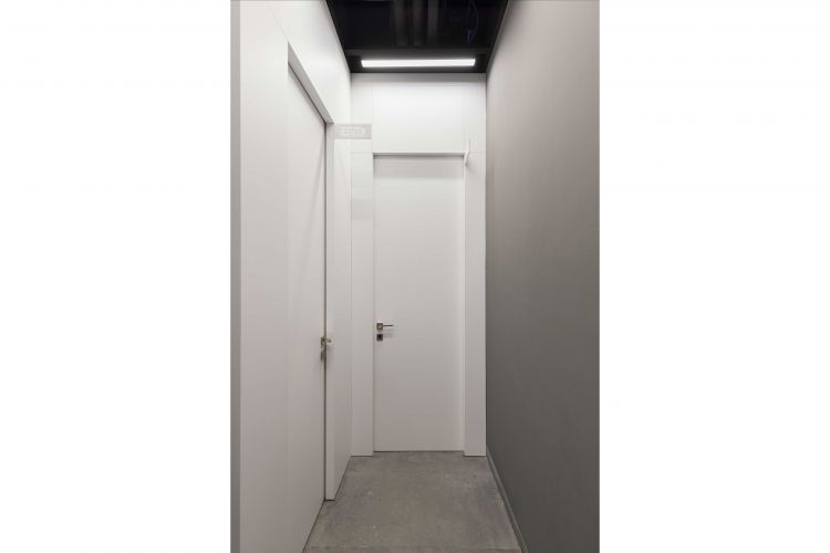
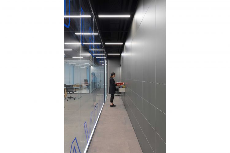
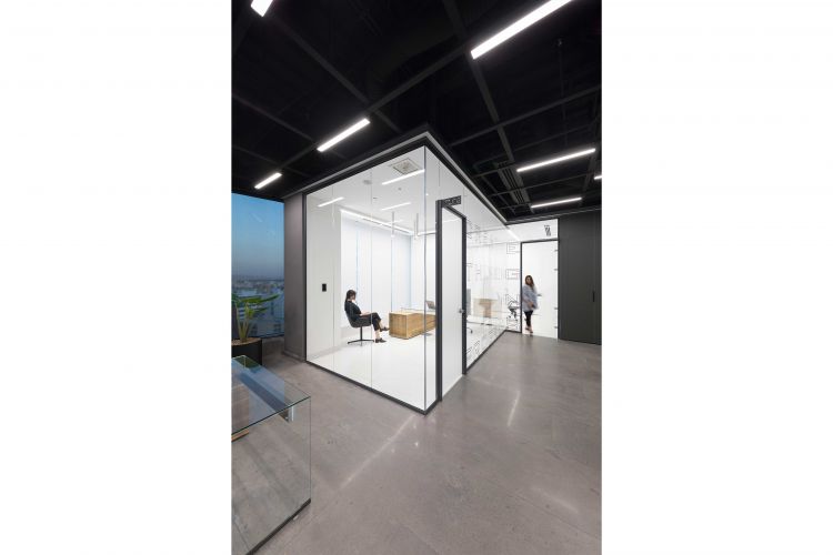
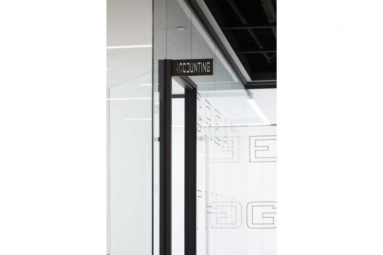
At this point we approached the eastern parts that were reserved for the personnel and envisaged the specialist and accounting rooms in the southernmost part near the windows and in the form of transparent white boxes that are placed on the gray bed of the whole unit. The archive should be a long space with many drawers and cupboards; we matched it with the edge of the entrance arch of the middle unit's door which was blinded so that it would have the right width and the extra edge we had fit inside it. It also turned into a clear and elongated box with many cupboards and drawers and a table to explore!
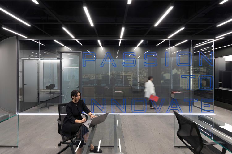
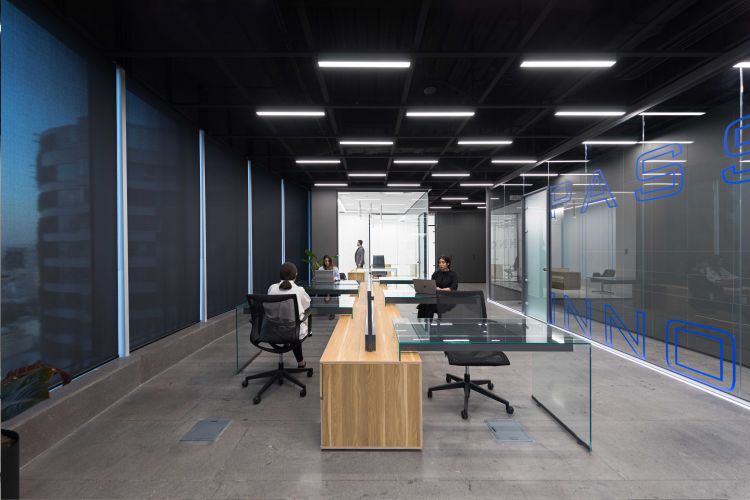
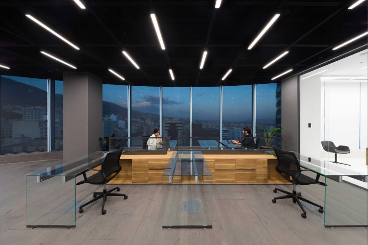
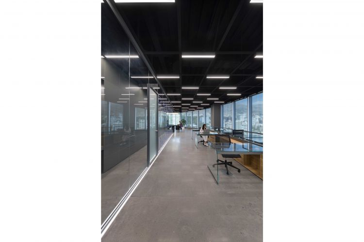
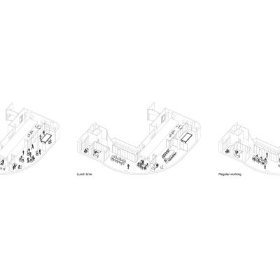
The rest of the spaces in this part were assigned to the personnel zone, which is completely open and faces the eastern windows. Here, there are only tables and chairs that shape the graphics of the space. We designed the tables in such a way that an elongated wooden box forms their central line, and the upper surfaces and bases, which are all glass, are mounted on it to create maximum simplicity and transparency. We designed the box of the desks to be wooden to reduce the coldness of the office space.
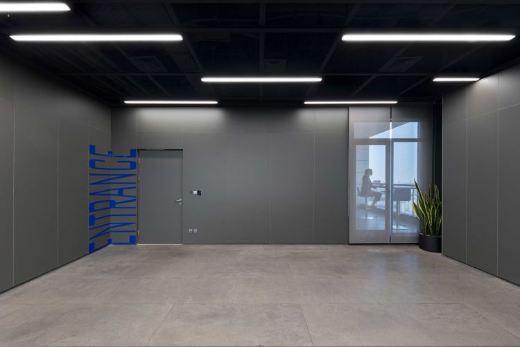
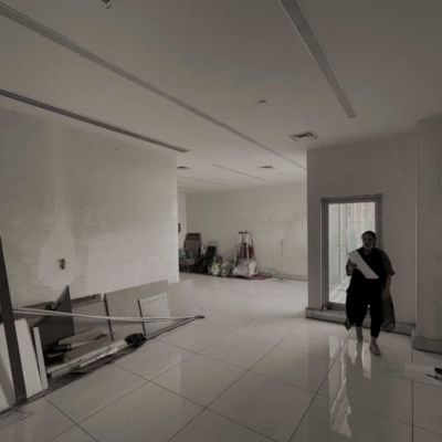
Since the height of the units seemed short, especially considering the aggregation and extent of the space, we removed the false ceiling of all public areas and only the rooms were roofed due to acoustic issues.
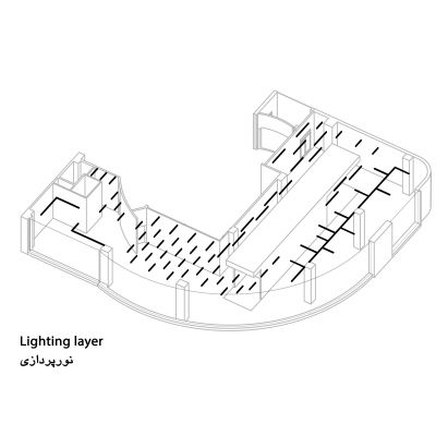
The lighting of this exposed ceiling should have worked both with the rectangular graphics of the center of the plan and with the curves of the windows around the plan; the layer of linear lights whose length and density change according to each space was the right answer. At the same time, the rhythm of their placement added to the dynamic of the spaces, which is especially evident around the middle box and the main corridor, where the reflection of these lines can be seen.
For flooring, we wanted to use gray micro-cement to make it matte and in unison, but the client only liked stone. After much deliberation, we found basalt stone. An amazing stone that has a design and texture similar to concrete and could be a good substitute for micro-cement.
